For a period of a few weeks I decided to create a brand-new graphic for every single day. I did this in probably the most inefficient way ever; I put it off until about 10PM every night and then feverishly worked to create some cool new effect. After the first few days, the dates were changed less and less often.
I got too tired to do it any more.
Here are the dates I did, along with some comments about each one.
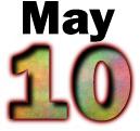
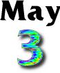
This is kinda hilarious. It may look plain, but I spent quite a bit of time getting this one "just right." I took great care in getting the right colors and I must have tried a bunch of looks that just weren't good. When I finally finished it and uploaded it, I left it there about an hour before someone told me that it was MAY this month. That's why this one and May 10'ths are almost identical. (See if you can spot the difference!)
I always liked this one. I think it looks like some kind of fibrous metallic substance. Other people haven't shared this vision; I've had complaints that it's too messy.
This was a bit of a rushjob. I can't quite remember what I was doing but I don't like this one at all.
Now this one is another favorite. I love the metallic gold sheen. The sad thing is, I don't think I could ever reproduce this effect ever again.
I like the effect (I had just "discovered" how to do it with GIMP) but in retrospect, I probably should have used a sans-serif font, at least for the month name.
The drop shadow on "April" is a bit gross, but I liked the metallic effect on the numbers. This is another "couldn't ever reproduce it" effect.
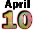
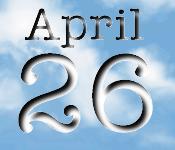
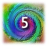
Oooh. I love this one too. There's such a 3d effect to it, even though I only used channel ops and other 2d filters to get there. I think the numbers look like old chunks of metal type.
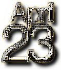
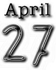
I was so proud of this when I first did it. The font isn't one of those standard grunge faces; it started out as a normal face that I grungified with GIMP. I'm still pretty impressed with how it turned out.
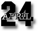
See April 10 above.
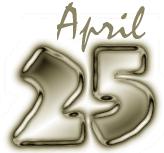
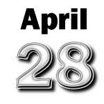
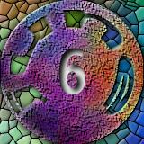
Bleh. This one is ugly. This was my first use of the supercow tip.
I like this one. I made it with the bumpmap plugin, and the textures are pretty nifty. I also used the "chamfer" plugin that had just come out to giver it the bevelled edges.
Heh. Hard on the eyes. One of my first forays into working with HSV manipulation, it was interesting only in an abstract sense.
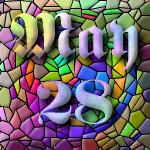
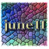
This makes me think of a medieval cathedral. Mosaic was (and still is) a very awesome thing.
What can I say? I was out of ideas on that day.
This is from my canvas textures tutorial. The plasma looks awful. Oh well..
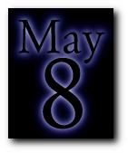
I like the halo effect. Used with the right colors, it can look great. This one looks great to me.

To me this looks like Caslon Antique, but I didn't use that font. I roughed up some Garamond and used the canvas tip to get the final effect.
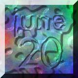
I really like this one. It's from a gimp-list post about creating an effect that looksl ike layers of paint. Later, I realized it's almost impossible to see the tiny letters "j u n e" in each corner of the image.
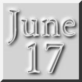
My very favorite. I think this may be the closest I'll ever come to Quartic's beautiful, delicate, and intricate constructions.
This one was mainly just an experiment with the text. When that didn't really become too interesting, I added a drop shadow and threw in a mosaic background. So sue me.

I was playing around with doing subtle shadow effects. The looping happened almost as an accident, but I think it turned out all right. I also like the gently rounded "June" letters.
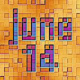
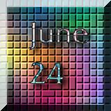
This reminds me of a drawing for some reason. I think it's because the sqaures are a bit off kilter and make it look like a hand-drawn geometric study instead of rigid, perfect computer lines.
This one is boring. What can I say.
Blobs of jelly. This was done with an earlier version of the lighting plugin.
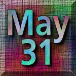
Done with tiles, but it's nothing terribly original otherwise. Sigh.